Want a more visual way to maintain your timeline?
Here are a few visual tricks I've picked up along the way, which lend organization and simplicity to my timeline. As I illustrate a couple of color dynamics I use, you might find some rhyme and reason of your own – or something you can poach off of me.
Infrastructure
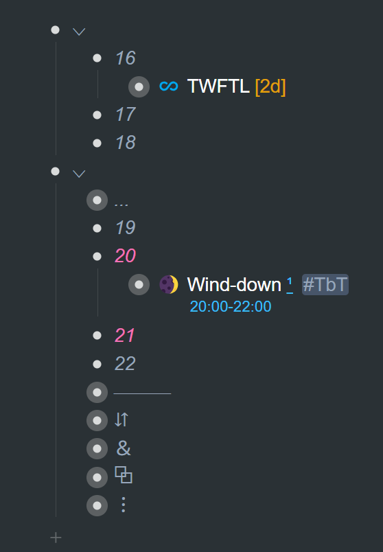
The infrastructure of my timeline is mostly gray. I've done this because I want the structure to fade into the background. I want to be able to focus on the things within that structure.
Take another look at the time blocks in my daily planner, as well as the rest of my top-level infrastructure. It's mostly gray. It doesn't call attention to itself:
Here's a screenshot in light mode:
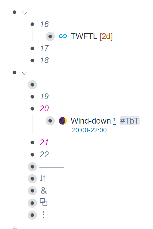
Gray fades into the background a tad bit.
And here's another look at the infrastructure of my calendar:
I want to be able to focus on the information (my tasks) as opposed to the infrastructure.
It is worth pointing out, that you don't need to be constantly coloring your infrastructure or most other things shown here. It's a one-time setup. What you would do is have your template of time blocks and your calendar template already formatted the way you want them. There's no need to tinker with color endlessly.
Select time blocks and calendar dates
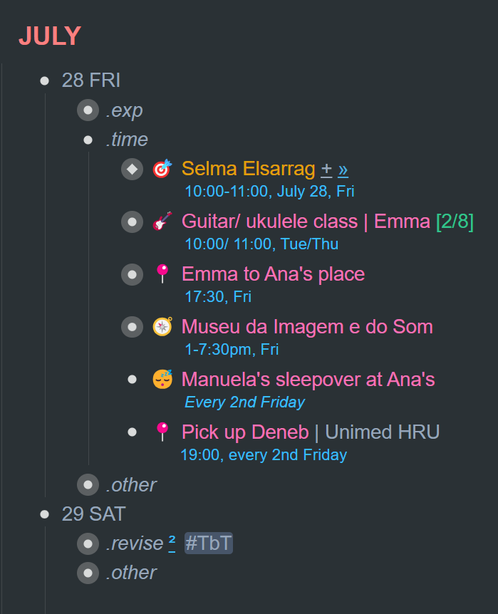
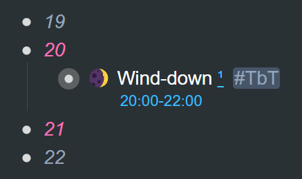
Coloring the time blocks in your daily planner according to periods of your day is something you could try out. The only fixed coloring I have are the 8pm and 9pm time blocks. They're colored to pink. I've reserved pink for family time and anything related to family activities.
Here's a screenshot from the "routines and batching" chapter:
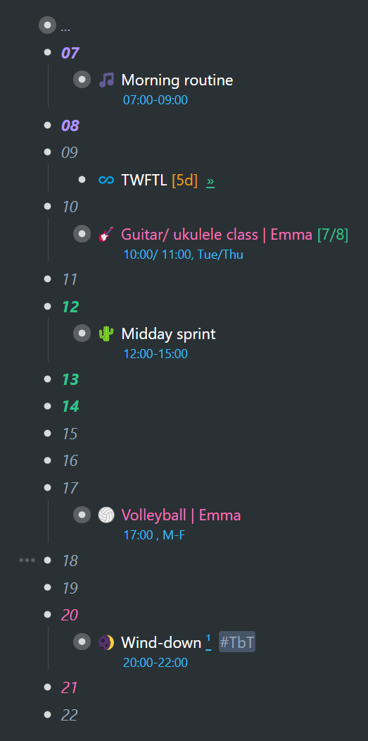
You can go ahead and color your time blocks for different periods of the day if you like it visually. Or you could color multiple, disconnected time blocks a certain color to show where you have free time for a specific project.
You've also seen my left bar several times before:
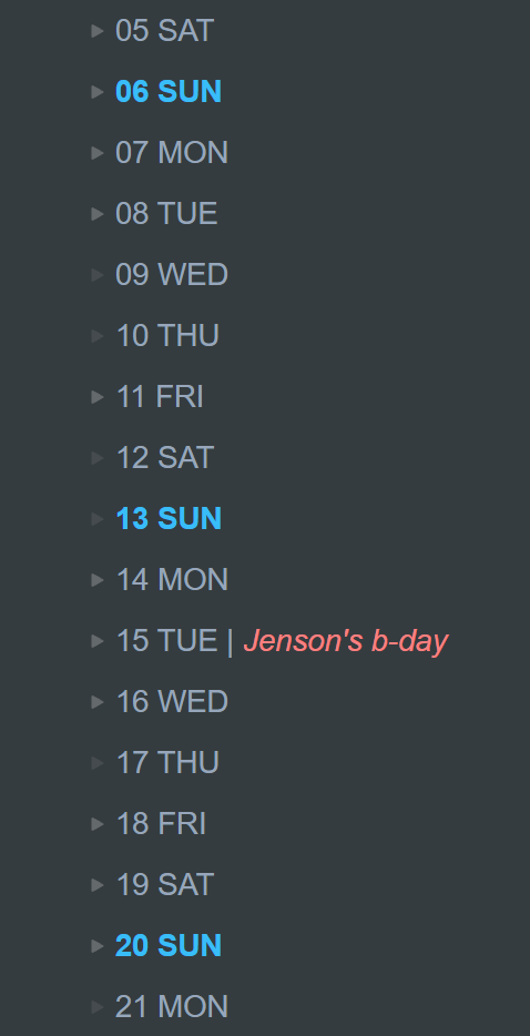
By giving a specific day of the week a different color (and maybe bolding them), you can easily demarcate weeks visually. This is especially helpful for dragging and dropping across weeks in your left bar. This is a trick I picked up from another WorkFlowy user. I can't remember who, but I especially like it.
Items and their metadata
I've come up with a color scheme for all my items, along with their metadata – patterned after road signs… which were designated in a rather logical and intuitive way, so it feels like a good fit for me. Here's a cheesy analogy:
Our timeline is like a long stretch of freeway ahead. We have sign posts all along the way to regulate, inform, etc.
Here are a few colors we find on road signs (and in my items):
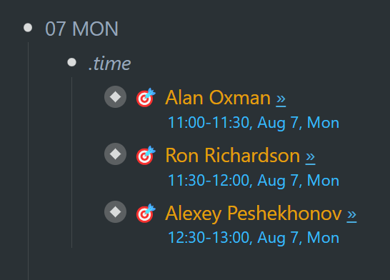
1. Blue indicates road user services and tourist information.You'll notice that I use blue for time and date metadata.
2. Green shows permitted traffic movements or directional guidance.I use green for metadata that gives me extra information/guidance.
3. Yellow conveys a general caution message.Yellow helps me to spot those events related to work or coaching sessions.
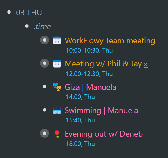
I need to be sure to set a reminder so that I don't miss these scheduled events. They're strong commitments.
Whatever colors you end up using, try to make them uniform across your timeline. That way you get to visually organize like tasks in whatever context you happen to be.
Clutter and long lists →Workflowy is a minimalist note taking app that helps you organize your life. Simple enough to hold your grocery list, powerful enough to hold your entire life.